Spectacular Cities!
One thing I find humorous about South Korea is that they apparently went through this 'branding phase' where they felt the need (on a tourism standpoint?) to give the country a motto, or logo, or whatever. So walking around you see this pasted up in numerous places:
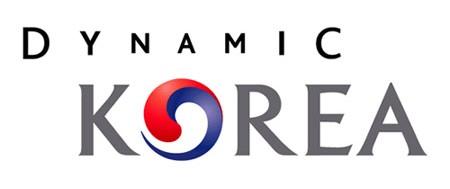 Oh, but wait! It actually is well thought-out! Here is the official statement/explanation on the new dynamic name:
 "The new design represents a contemporary interpretation of the traditional Korean taegeuk (yin and yang) pattern and seeks to express new waves of change and innovation. The design also symbolizes the vision of a dynamic future as well as energetic, self-confident and high-tech images for the nation.
"The letters of the word 'DYNAMIC' gradually increase in size as they move toward both ends in a symmetric way with the letter "A" serving as anchor. This expresses the nation's aspirations to reach out to every corner of the world, win popular international support, and achieve national prosperity. The red and blue colors shown in the taegeuk pattern further symbolize the inspiration of the present and the future dreams of the Korean people."
Yes, that's exactly what I thought when I saw that logo...
Then various provinces and cities began to join in the fun, scouring the English language for various complimentary adjectives (or in some cases, greetings) to stick before their name. The first one I became aware of was Happy Suwon.
 Now, at first I thought that this was just a cute (and funny) nickname...but just the other day I learned that 'Happy' also stands for something! That's right, it's an acronym! Without further ado, here is the acronym:
Harmonious
Abundant
Paramount
Prosperous
Young
Abundant
Paramount
Prosperous
Young
If that doesn't give you a clear idea of the type of city that is Suwon, I don't know what would! I personally also love how the H doubles as two people shaking hands...
 I actually find Seoul's to be the weirdest...but again, there is multi-faceted meaning behind the choice:
"The name combines the greeting "Hi" with the name of the city "Seoul , the new brand aims to convey a friendly image of Seoul to the global community, and to promote harmony and unity among Seoul citizens. Since "hi" is a homophone of "high , the brand offers a new vision for Seoul and reflects the city's commitment to make Seoul one of the world's leading cities. The design of the brand features three colors to represent Korea: blue, red and yellow."
Sure...what I love most, however, is that this was chosen out of a crap-load of entries:
"With the aim to introduce a city brand, representing the nation's over 600-year-old capital, Seoul City held the Seoul Brand Contest from August 18 through September 5, 2002. A total of 7,283 entries were accepted. Among them, 'Hi Seoul' got the highest marks from the expert selection committee consisting of experts. During the Citizens' Day celebration in October 2002, the city government announced its selection of 'Hi Seoul' as the city brand."
At first I didn't think Pyeongtaek had a 'brand' and it really saddened me. But yesterday I came across an official-looking sign hanging on a bridge that had the sharp looking logo, Super Pyeongtaek! Woo-hoo! Houston, we have lift-off! I couldn't find a picture of it online, so sometime I'm going to have to head back to the sign with a camera and get the job done myself.
Anyway, here are a few other city brands:


Fyi, Gyeonggi-do is a province, not a city. And Yongin seems to be having an identity crisis, as my friend who lives there told me that she thought it was Global Yongin. Oh, and Busan? Just to let you know, your adjective is already taken...by the country...
posted by Emily at
10/15/2005 06:54:00 PM
![]()
![]()


0 Comments:
Post a Comment
<< Home